 from FASHION 156
Before going straight to the topic, just a little update of my life.I think I can understand the message that go trying to tell me, I know it sounds superstitious; but you always need some guidance when you feel lost.
在進入這篇文章的主題前, 容我碎念一下. 最近我終於能體會當時我抽到的籤裡面的意義, 或許看來有些迷信. 不過再彷徨時有個指引和心靈的寄託是很重要的.
From the poem it told me to go back to my old path, first thing come up to my mind is go back to Taiwan. Until joining jewellery design course I understand accessories design is going to be my future plan. However, this was what I do before I go to UK; so me and my friend decide to restart our collaboration, we are going to sell our work in different designer market and you can see some of my work in my handmade page.
我抽到的籤詩暗示我要回到舊路, 當時我第一個想到的是回到到台灣. 不過然後呢? 直到最近開始上珠寶設計的課程才瞭解原來他要我回到我最初想做的事. 就是飾品設計, 在出國之前和我朋友就有在擺創意市集, 最近決定在從新開始, 所以你可以在我的handmade(手作)頁面看到我們更新的作品, 然後在我的Fb頁面看到我會在哪些市集.
Back to the main topic, I discover this brand- Tatanaka weeks ago, is quite surprising that I don’t know this brand while I’m still in London. Because it was found in London by two identical twins – Tamara and Natasha Surguladze, they were graduate from from Central Saint Martins. The twin sister were born in Tbilisi, capital of Georgia. I’m really bad on geography , so I google the location of Georgia; it is locate at the north of Russia and south by Turkey and Armenia.
好 回到主題, 最近我發現一個英國倫敦崛起的品牌 – Tatanaka. 我很驚訝我在倫敦待那麼久竟然不知道這個品牌, 這個牌子是由一對雙胞胎姐妹 – Tamara, Natasha Surguladze創立, 他們從倫敦聖馬丁畢業. 這對姐妹出生於喬治亞, 我得地理很差, 不瞞你說我google了一下他的地理位置. 是在俄羅斯的南方以及土耳其的北方.
“As the two of us work together, our designs often reflect the contrast of two opposites and reveal the dual nature of the brand. Our collections explore the unexpected; we play with the illusory but always maintain a sense of humour. One of our signatures is our in-house prints that are based on our paintings and photography. We always aim to create timeless pieces for our customers: pieces with which they will fall in love.” even they each have their own style of creation, they can always combine two contrast into harmony with creativity technique.
“當我們兩個人一起設計時, 我們的靈感都從兩個極端不同的點出發, 顯現出我們品牌的一體兩面. 我們的設計總是充滿驚喜, 有種虛幻且帶有幽默的感覺. 我們的品牌識別設計是印花設計, 源自於我們平日的繪畫以及攝影. 目標是持續設計讓人愛上的衣服” 由此看出, 他們兩姐妹有著兩個不同的想法, 不過也就因為這樣可以產出令人愛不釋手的設計.
They also talk about their ideal customers , “She is adventurous and romantic, with a great sense of humour. She doesn’t feel the need to follow the trends but is capable of creating her own unique style.” it reflect back to my previous article about Mina, their aim is come up with a brand signature style instead of trend.
他們也提到他們理想中的客戶是 ”她會是喜歡冒險且浪漫派, 個性幽默的, 她不需要追求時下的流行但有能力創造自己獨特的風格”. 如果有看過前一章有關MIna的文章, 他們相似的品牌目標是希望能創建品牌風格而不是盲目尾隨流行.
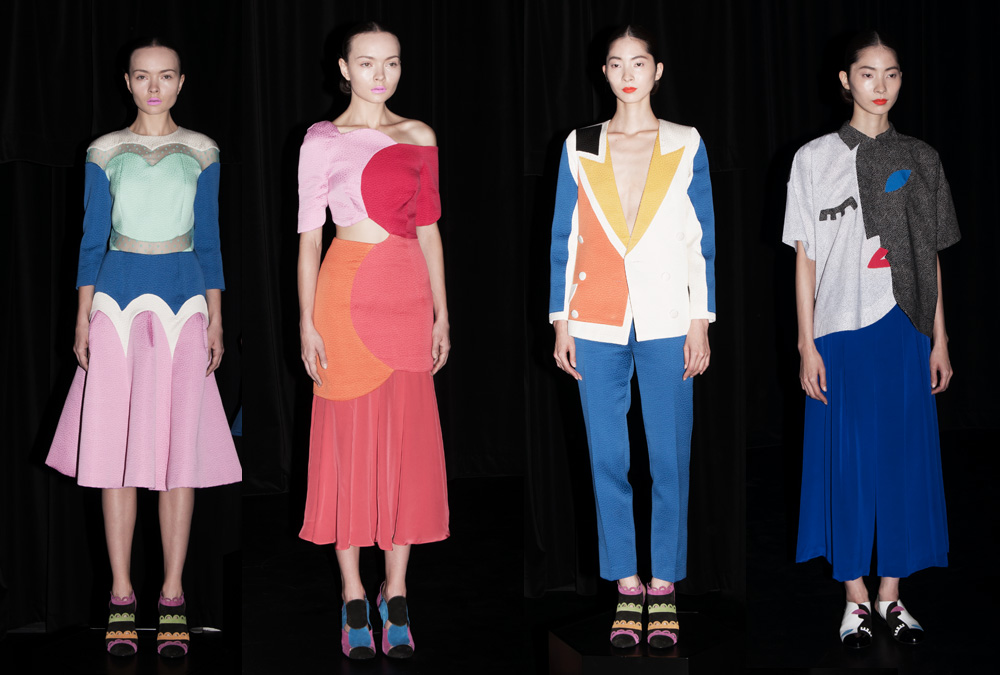
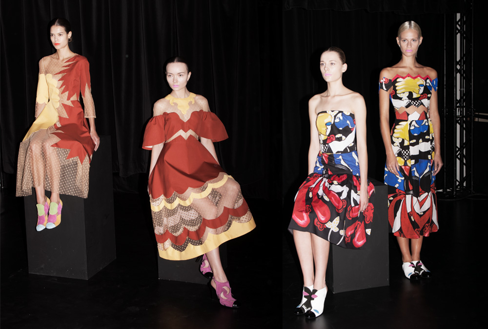
I really want the whole collection of Tatanaka SS2014 collection, they took inspiration from modern painting and Russia ballet. But you won’t like the design to Russia ballet when you look at the design, “We wanted to start with that as our concept but in the way that with their productions, they didn’t end up the way they started out,” is not about the appearance of ballet style but their philosophy.
我真的很想要擁有他整個SS14系列, 這個系列靈感來自於俄羅斯芭蕾, 光看設計不會讓人聯想到俄羅斯芭蕾, 他解釋 “這只是支撐這個設計背後的精神指標, 我們最後的成果總是會讓人有一想不到的結果” 他們想傳達的是俄羅斯芭蕾那戲劇化的概念而不是外表而已.
But you can see strong artistic feeling from the collection, with a colour blocking patchwork, the contrast feeling between solid colour and sheer touching. The colour combination is like a mixture of Matisse painting and pop art design, it totally push the boundaries, and give people a great visual adventure.
不過從設計來看, 是充滿藝術氣息的. 幾何大色塊拼貼以及飽和色系和薄紗的拼接, 再配上有趣的圖案. 整個風格讓人看到了普普藝術和畫家馬諦斯的融合. 這款設計徹底突破, 給人一場視覺的饗宴.